How Emotions form an integral part of User Experience?
User Experience - by using the word ‘experience’ in this term, it is evident that users put their emotions to use when buying a product or a service. There could be a lot of reasons that make them feel emotions, such as disappointed, joy, satisfied, happy or frustrated. While using a website, or an app, a user is likely to feel more than one emotion. Having said that, it is evident that emotions and user experience go hand in hand.
Holiday Quick Poll was recently conducted by Iterable, which indicated that 83% of the people are more likely to purchase from those brands which made them feel an emotional connection.
Annette Franz, the CEO and Founder of CX Journey Inc., in a CMSWire webinar, recently stated, “There’s a real opportunity for brands to show they care by taking the time to understand customers and infusing that data and their learnings into every touch along the customer journey.”
What exactly is emotional designing in apps and websites?
Emotions are what compose a human being. Users heavily rely on their emotions to understand reality surrounding them. A user will repeat purchase on the basis of positive emotions, and keep off from buying something due to a negative emotional response wired through the brain.
In simple terms, emotional design means how a digital product will make a user feel. Emotions are the perfect single most powerful factor which will drastically create an impact over success or failure of an app or website.
Emotional Design: Why We Love (Or Hate) Everyday Things is a book authored by Don Norman. In the book, Don breaks emotional responses of users into three vital stages, viz.:
Stage I - Visceral: This is what we can call making the first impression, and is the most basic emotional level response. Good UX designing is simply the one which will make users “feel” good or bad right off.
Stage II - Behavioral: At this stage, a user will be under evaluation stage. He/she might interpret your website or app on the basis of its functionality. They will gauge around and see how responsive or easy it is to look for solutions across your app or website. In visual designing, it would simply mean whether the app or website is navigational, user-friendly, cluttered or uncluttered or not. It is basically about how the interface appears. Easy UI is directly proportional to positive user emotions.
Stage III - Reflective: At this stage, a user is putting his/her highest cognitive level approach to use. Subconsciously, a user will try to strike a balance between benefits and disadvantages of the product. It is at this stage that a user will form an overall impression of app or website design.
How important are emotions in great UX?
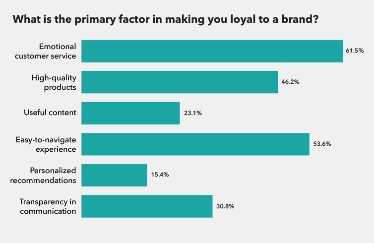
According to Sitecore, 61.5% of the users believe that brand loyalty is built on the foundation of a great customer experience.

Look at the image and you will also see that easy-to-navigate experience also forms a high percentage of what comprises a good UX. On that note, let us also talk about aesthetics of a website.
Aesthetics and Usability
Aesthetics could play a role in usability. Great UX means great business results. So aesthetically, what could be the top 5 best practices for UX in a website or app?
- Fast, responsive and logical navigation - On an average, a user will spend no more than 10 seconds on your page in the first go. Broken links need to be fixed to ensure that a user is not annoyed.
- Update and keep up to date - A user will be frustrated if the content or information on your website is outdated. Latest dates are reflective of your website being up to date.
- Mobile optimization - Who uses a laptop or a desktop these days? An average user will make use of mobile on the go. Making your website responsive for use on mobile and faster migration from a bigger system to smaller portable device is essential.
- Visual effects for positive impact - A user will remember what you show them, instead of what you make them read. Have image-friendly content on the website or app, for your users to remember.
- Test - Use heat maps and A/B tests to keep your website under check.
UX and Usability
Usability can be seen as a subset of a wider term called user experience. Usability is a part of emotions. In layman terms, usability is defined as ease of use of your app or website. It is indeed a crucial aspect of UX, but it is also just one among many aspects.
Evaluate UX for your website
The three step process to evaluate UX of your website can help you.
- Buyer Persona - You must walk in your users’ shoes for a mile to know what exactly they’re looking for. There can be certain approaches for this, one of which is, creation of user persona. It is also believed that some of the most important buyer personas are dependent upon market research, along with insights accumulated from real-time customer base.
- Follow user behaviour and draw conclusions - There are Google Analytics, and web analytics tools that can be used to follow user behaviour to infer what exactly they’re looking for.
- UX Survey - Getting a rating of your website from users, checking whether or not a visual design fits in, knowing about content clarity on website, and understanding from users if they had difficulty finding information on the site- are some of the good tools to put to use.
Key Takeaway
Digital world is an ever-evolving place. Emotions and UX go hand-in-hand because ultimately, your website is only interacting with a human and not a machine. So, there’s a dire need of evolution to ensure that your brand does not just “connect,” with the audience, but also “interacts.” You may refer to it as omni-channel, cross-channel or multi-channel, but it’s all about engaging your users online.
Iterable Holiday Quick Poll also indicates that more than 50% of the ones making more than $100K annually are more inclined in making a purchase from a brand that makes them feel “emotionally connected.” Hence, emotions and UX go hand-in-hand.


